Initial Thoughts on the New Google Maps

It’s like going to a fancy new restaurant with a months-long reservation list. You finally get through the portal, anticipating a remarkable culinary experience from a renowned celebrity chef. The waiter carries an enormous plate across the dining room, removes the cover from the dish with a flourish, and presents a tiny two-bite morsel plated exquisitely. “Where’s the rest of it?” you ask in bewilderment. “That is the rest of it, Sir,” responds the waiter with disdain since you obviously can’t appreciate the gift he just been bestowed upon you. Right. That’s my initial impression of the new Google Maps.

That’s my nicer description. I’ve warmed up to it slightly over the last couple of days. It’s a step forward in some regards and a step backwards in others. I do enjoy the redesigned street map layer and the stripped-down screen that offers wider coverage. Directions between points provided new options including airline directions, with a link to low-priced airfares.

I also found Street View easier to navigate and the recent imagery is stunning. Thankfully I weeded the flower bed in front of my home before the Street View car drove through the neighborhood a few months ago. It offers amazing resolution.


Too Simplistic

Is it possible to strip something down too much? Couldn’t Google add a vertical pop-up menu bar on the left or right side of the screen, like its new Explore bar along the bottom of the page, with a selection of common functions? Beyond that though, there were functions and features from the previous version of Maps that I couldn’t find anywhere.

In fairness, and before I gripe too much, I recognize that my operating system and software configuration supported only “Lite Mode.” Perhaps the features I missed so dearly will reveal themselves in the full-blown version or maybe they’ll roll out with the final release, or maybe they’re all right there today and hidden in some odd way?

  • I couldn’t find a way to generate HTML code to embed maps in an external website. That’s a huge problem for 12MC which uses that capability extensively.
  • The terrain layer no longer seems to exist.
  • I couldn’t find a print button with the exception of a single place — after I generated directions between points and selected the step-by-step instructions link.
  • The pan disk, slide bar, and drag-and-drop man were all removed. Only a +/- zoom option remains. Actually, I probably won’t miss those much.
  • Remember how hard we pushed for county lines? Gone.

Focused on Social Networking

The new version of Google Maps does not cater to map-heads and geo-geeks. Instead, Google’s definition of social networking takes the center stage. I understand the world marches on and I don’t want to become the person who mourns the past simply because something changed. I wanted to give the new Google Maps a fair shake and meet it on its own terms.

Thus, I attempted to share a map with my 12MC Circle on Google +. This is how it appeared on my screen:
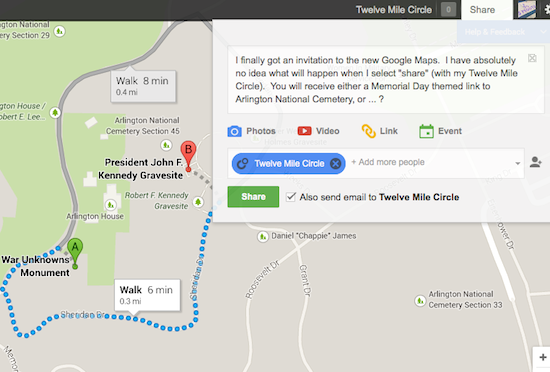
Sharing Google Maps

I was hoping that I could post the results of a simple mapping exercise to a wider audience. The text (and only the text) forwarded to my G+ circle and that was the extend of it. I couldn’t find a way to send the underlying map to my Circle. Either the interface wasn’t intuitive enough or I wasn’t advanced enough in the intricacies of social networking to grasp its essential functionality. This is supposed to be a big step forward as a means to infuse geographical dimensions within social settings. Unfortunately I don’t know how to make the leap. Google charted a course and it left me behind.


Deprecated Functionality

The new Google Maps does have a toggle that brings one to a feature they call Classic Maps. Here’s my concern: understanding that Google had no problem abandoning Reader and its millions of users, how long should one expect a toggle to remain in place for an obviously deprecated version before Google decides to pull the plug on that one too?

Now I have to figure out how to replicate the functionality of what they’ve typecast as Classic (a.k.a. “Old”) if I want to keep producing mapping content for 12MC. Google’s Maps Engine Lite which is currently in Beta will still support self-designed maps, so I think I’m safe there.


Other Solutions


View Larger Map

However, if I need to embed a simple map — and most of what I produce falls within that category — then maybe it’s time to switch to OpenStreetMap. The example above looks pretty good, doesn’t it? Maybe that’s what I’ll do. Cobble together functionality from a bunch of different places. And yes, I’d still use the new Google Maps to create directions for personal use outside of 12MC because I do like that set of features and I feel it’s genuinely improved.

My needs are simple. When I need to seek advice — like Kentucky vacation recommendations — I post a request to my website. I don’t think it’s fair to require all of you to subscribe to Google+ and then join my Circle for me to be able to do that. Therein lies my dilemma. Google seems to be refocusing Maps as a tool to push everyone in their direction.

I only want to share my little geographic discoveries. I hope the final version of the new Google Maps retains some of the prior functionality that made it so wonderful for geo-geeks. Nobody would be happier than I if I had to eat crow because Google proves my initial reactions wrong.


Posted

in

by

Comments

10 responses to “Initial Thoughts on the New Google Maps”

  1. Greg Avatar
    Greg

    This was pretty much my experience (although county lines still show up when you search for a county, like the old Maps). I think I finally figured out what bugs me about the new Maps after a couple days mulling it: it doesn’t allow for any stray clicks. Every time you click something, something on the screen changes—and usually in a way that blocks a lot of what I’m trying to see. Also, I *don’t* like the new Street View interface, because as far as I can tell, there’s no way to see what streets are covered with that blue outline bit. By the way, when you sent the post to us about the Cemetery, did you click the “link” button on the screen? I don’t know what that does exactly since I haven’t tried it yet myself.

    1. Twelve Mile Circle Avatar

      Oddly enough, I didn’t get a link (maybe because I was the author?), so… I don’t know what it does either. I’ll just call it the mystery button for now.

  2. Mark Sundstrom Avatar
    Mark Sundstrom

    Thanks for the early review. I’ve contemplated trying to get an invite, but now I think I’ll just wait.
    Perhaps the “sharing” feature didn’t work yet because it’s not in wide use? Hard to know.
    I’ve switched to using OpenStreetMaps and Leaflet for the mapping work I’m doing these days. Works pretty well.
    Thanks,
    –Mark

  3. Mike Lowe Avatar

    If I need to see county lines better (darker & clearer) than what Mapquest shows, I use the setup at Mob-rule. Hopefully Google doesn’t break that.

  4. stangetz Avatar
    stangetz

    Here’s some things I’ve noticed:

    1. the 45deg tilt function used to be actual oblique imagery, but now it seems to only be the aerials tilted. At least in the areas I checked it was.

    2. Google Map Labs functions are gone, too – I had the ruler and rectangle zoom loaded and used them almost every time. But they are nowhere to be found.

    3. It seems to me that along with the social aspect, Google really only wants you to search for locations, not explore on your own. Now, granted, Google is a search engine company, so it makes sense, especially if they are generating revenue from those searches, or even (better? worse?) they are generating a database of searched places. By limiting you to only searching, you have no choice but to use their business model.

    4. I’m also irritated with the removal of the terrain layer. I used it quite a bit because river and stream names do not show up in the regular map view.

    Of course, this is all a free service, so I guess we cant be picky.

  5. Lee S Avatar
    Lee S

    Don’t even get me started on the new MapQuest and the abandonment of MapQuest Classic…

  6. The Basement Geographer Avatar

    I echo the above sentiments. The lack of an ability to embed a map or even send a link is infinitely frustrating (TBG uses hundreds of embedded maps, just like 12MC). The 3D Earth feature is fine for my work computer and laptop, but my for older desktop, it’s useless even though the thing’s only three years old. I can only imagine how many other people will find that to be true for them. I don’t do social networking (hell, I don’t even Tweet), so I could care less about connectivity to Google Plus. I’m holding out a little hope they’ll tweak things before the full launch, but I’m very doubtful. I’ve already had to sign up for a Feedly account this spring; hopefully I won’t have to ditch Google Maps, too. Viva OpenStreetMap, that’s all I can say.

    Oh, yes, cheap plug – the all-new BasementGeographer.com launches Saturday, June 1st!

  7. hipsterdoofus Avatar
    hipsterdoofus

    I hadn’t messed with this much as I was out of town on vacation. I do still get county lines although they area doesn’t have a red highlight as previously, so it isn’t as easy to see. It is pretty sad that they seemed to have stripped out several layer options.

    From what I have seen, I like OpenStreetMaps from what I’ve seen of it and it certainly lends itself to mapheads and geo nerds. I use a site that uses the OSM layer for Ingress (which is a game that geo people may be interested in by the way).

  8. Philip Newton Avatar
    Philip Newton

    Terrain is gone, too? Meh.

    The first two things I missed are the ability to turn off the “English” layer (which was fun for a language-head like me – see all the geographical names in the native language and script, whether they be Chinese or Czech) and the ability to set a default location.

    Since Maps can’t pick up my real location from my browser, it started over the US – in Maps Classic, I could tell it to start up with “Germany”.

    If you always search, it doesn’t matter so much where the initial view is – but I like to explore, and there it’s usually convenient to start near where I usually am. As you noted, the maps don’t lend themselves for exploring.

    And finally, I also missed the ability to set a different zoom level at a click – useful when exploring other places since I could zoom out quickly and then pan to where I wanted to start exploring before zooming in again. Clicking ‘-‘ half a dozen times just isn’t the same thing.

    I’ve switched back to Classic for now, but I also wonder how long we’ll be able to use that.

  9. James Dowden Avatar
    James Dowden

    And this has gone down even worse on this side of the Pond, as they’ve messed up the colour-coding of roads. It’s bad enough that they’ve decided that motorways should be orange and not blue, and primary routes yellow and not green (despite those colour conventions being very firmly established, and even used on road signs), but collapsing it down to just three levels of classification is a disaster. A white road now could be anything from a minor street to a major arterial A-road. It makes legibility in rural areas terrible, as the result is that all roads are the same colour, and nothing at all appears until one is zoomed too far in. What a mess.

Leave a Reply

Your email address will not be published. Required fields are marked *

Latest Comments

  1. Hi Mr. Howder — Just going from memory, I recall that your “rule” for counting a nation/state/county is “if I’m…

  2. Does anyone have actual music to the song – Tanaha ,Timpson. Bobo and Blair ?? It was recorded by Tex…