I guess I didn’t know until this morning that license plates, those little identification signs we attach to our automobiles, are more generically called vehicle registration plates. Right now I’m sure my North American audience is wondering why I even bothered to define “license plate” when the meaning is so intuitively obvious. That’s because the name varies between nations and 12MC has an international audience. In some places it’s a tag, a number plate, or something entirely different.
More to the point, “License to Map” refers to the very simple fact that maps are a common design element on license plates, or tags or number plates, or whatever one may decide to call them. However, I noticed this feature appeared in the wild within a fairly narrow geographic band.
License plates first began in Western Europe in the earliest days of the automobile. That happened at the tail-end of the Nineteenth Century, when the term “horseless carriage” still prevailed. Collectors call this the Brass Era of automobiles due to an abundance of brass used both functionally and decoratively on the vehicles themselves.
License to Go Down a Tangent
I’ve always loved the term “horseless carriage”. One of my favorite Y2K stories (kids, go ask your grandpa if you don’t understand the reference) involved the horseless carriage. I’ll quote from a period news article published in 1999: “PORTLAND, Maine –– State government got its first Y2K surprise months early when owners of 2000 model cars and trucks received titles identifying their new vehicles as ‘horseless carriages.‘” I still smile every time I hear that although I have an even better Y2K story. Fortunately that was about the worst of the Y2K damage, we all got on with our lives, and I’ve rambled along a serious tangent. Let’s see if I can pull this back to the predetermined topic.
License Plates Come to the USA

Massachusetts probably issued the first license plates in the United States in 1903.
“At the time, no laws were governing the rules of the road which led to a great deal of confusion on the thoroughfares as well as a lack of public safety… The first plate, featuring the number ‘1’ printed on it, was issued to Frederick Tudor in 1903 and is still held as an active registration by a member of his family… Although Massachusetts was not the first to register motor vehicles, we did lead the way in issuing registration plates. These plates were made of iron and covered by an enamel porcelain. They had a dark blue background with white numbers and ‘MASS. AUTOMOBILE REGISTER.’ printed across the top. The plates were not uniform in size as the number of characters needed for a particular registration governed the length.”
Maps Appear
This size issue seems typical for the time. I flipped through uncountable license plate collector pages and sites. The early plates seemed to lack any kind of standardization whatsoever. They included myriad sizes with simply alpha-numeric characters stamped on a plain background. The earliest U.S. plate I could find that featured a map traced to Illinois in 1927. The design appeared rather crude compared to many modern plates.

A quick note on license tag images. It was surprisingly hard to find any that I could lift with attribution, so you’ll get what you get instead of a lot of nice illustrations. I’ll feature a few that came with Creative Commons licensing options (hover over the image for the source citation) and I’ll provide additional links to places where you can see others.
I counted about a dozen U.S. states that featured maps on their current license plates. There are others that included maps in the past that have not carried into current designs. Feel free to follow the link and count for yourself. I can’t guarantee that I found them all because I was beginning to get a little cross-eyed. They started blending into each other after awhile.
Solid-Fill

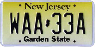
Most of them, like the New Jersey example provided above, used a solid-fill state map outline as a separator between an initial set of alpha-numeric characters and the remainder. In addition to New Jersey, the states of Kentucky, Minnesota, New York, and Tennessee followed similar patterns. Texas employed a variation on the theme because Texas always needs to be a little different, and they filled their state outline with a stylized “Lone Star” flag design. Missouri had similar placement although their map was much larger. Florida used a very large teal map with oranges superimposed upon it.
One-offs

Then there were the outliers. Ohio creatively placed its state outline beneath the initial O in the state name. Louisiana pushed their map to the left and superimposed a pelican atop it. Connecticut placed the state towards the upper-left. So Connecticut earns an honorable mention here because they included the Southwick Jog (take back the notch!).
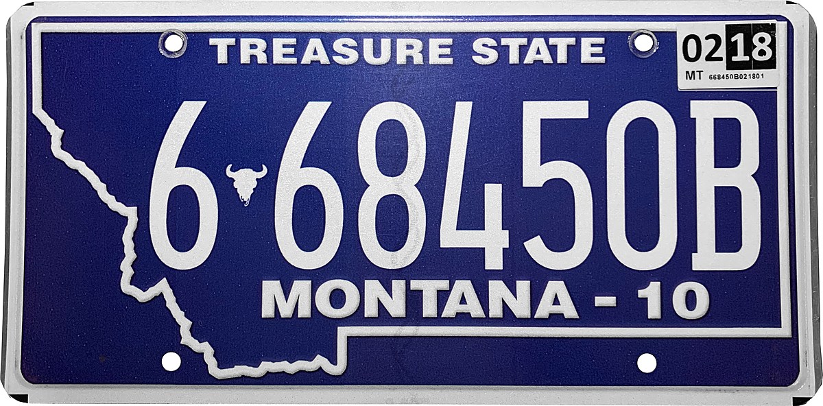
Montana is the winner. The outline map of Montana is the dominant feature of their plate.
Internationally

I turned my attention to international locations. I couldn’t find any in Canada or Mexico. This surprised me. Both nations issued plates for their secondary units of government — provinces and states respectively — and both featured a wide variety of detailed graphics and artwork. Mexican plates in particular showed great creativity. Canadian plates were pretty interesting too, especially Nunavut and the Northwest Territories, but nary a map between them.
I began to think that maps on plates might be a uniquely U.S. design element and considered whether this represented some sort of broader cultural characteristic. Then I discovered instances on plates from Bermuda, El Salvador, Honduras and Nicaragua. The rest of the world seemed bereft of license plate maps, though. I’m not saying they don’t exist. I just could not find any as I began to lose interest after a couple of hours of searching.
Maps used as a design element on license plate appears to be primarily a North/Central American theme. Canada and Mexico need to catch-up with the rest of the continent and print some maps on their plates.

Leave a Reply