I enabled Google Analytics recently on my web pages. For those of you who are unfamiliar with this tool, it involves the addition of a few lines of javascript to each page which in turn reports basic information back to the great Google mothership. It allows me to gain a better understanding of web traffic on my site from a variety of different perspectives.
It does not track personally identifying information. Therefore I can’t figure out who specifically looks at what. That’s a good thing in my opinion. However, it does allow me to dissect usage much more precisely than the tools my web hosting service provides. More germane to this discussion, Google Analytics comes with a powerful set of geographic traffic mapping tools. It’s now my latest obsession and a guilty pleasure.
Worldwide Scope

The maps are all interactive and allow segmentation by date ranges as well as drill-down to specific countries. The static screenshots that I’ve greatly reduced in size and featured in this entry don’t really do them any justice. Hopefully they provide a little flavor of what is possible.
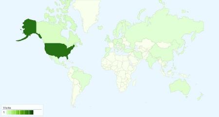
I started tracking with Google Analytics about a month ago and already I’ve recorded hits from many parts of the globe. It shouldn’t be too surprising that the preponderance of visitors came from the United States since that’s the focus of much of my content. For example, I don’t think the larger world really cares about my popular United States Domestic Ferry Map page, essentially by definition.
Under-representation
Hits have come from every continent (well, except Antarctica). However, my sample size is still quite low. Even so I found visual evidence of the Internet “haves” and “have nots” quite striking. If it weren’t for Morocco I’d have no traffic from Africa. South America doesn’t generate much traffic. Ditto for many of the former Soviet Republics.
Surprises
Nonetheless, I found some surprises too. As I drill down I can find hits from: Phnum Penh, Cambodia; Sofia, Bulgaria; Tegucigalpa, Honduras; Kandivli, India; and even the Northern Marianna Islands. I’m not sure what brought them to my website, but I tip my hat to them and appreciate their readership. I have almost that same sense of giddy excitement as ham radio operators who attempt to contact people in every country when I open this tool each morning and see what new locations appear on my list.
Examining the United States

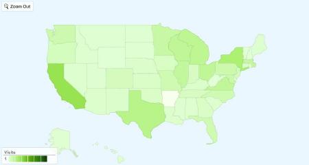
The United States page allows me to drill down to individual states. I’m not sure if that’s because Google tailors its display to my IP address and provides something similar to other users’ home countries, or whether that’s a USA-only feature. If any Canadian readers happen to use this tool could you let me know if it allows you to drill down to specific provinces?
What I see is something that isn’t too far away from what one would view on population charts. California, New York and Texas all produce lots of hits. Nothing too surprising. But why hasn’t anyone from Arkansas visited? It’s been a month. Can’t someone from Arkansas please stop by? No other state has produced zero hits since I activated the tool.
Looking At Individual States

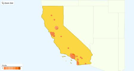
Then I can drill down to individual states. The red dots increase in size as more visitors appear from each locale. Country maps (other than the United States) also look similar to this. The population centers of California come through clearly in my traffic map: San Francisco; Los Angeles; San Diego and even Sacramento practically jump from the screen.
Another line of dots seems to trace the basic course of Interstate 5 as it works its way down the Central Valley, through the Sacramento Valley and San Joaquin Valleys, hemmed in by the Cascade and Sierra Nevada mountain ranges. Now you can see how I waste lots of time pondering these maps.
What this tells me is that I’m still missing a greater worldwide audience. Unfortunately I have a serious limitation. I can only write in English. However, even with that constraint there’s much more that I can do to reach out. Readers can expect more topics of international interest in the coming weeks and months. I’ve already placed a few into the queue to be developed.

Leave a Reply